We’ve all been there. You’re sitting on the sofa, snacks ready, the first ball of the series is about to be bowled, and then… the team walks out. Suddenly, you aren’t just looking at the pitch; you’re staring at the kit. Whether it’s a bold neon experiment or a classy throwback to the ‘90s, a team’s shirt is their identity. It’s what we wear to the ground and what we see in our favorite highlight reels for years to come.
Lately, we’ve seen some absolutely stellar shirt “refreshes”—those moments where a team takes their classic look and gives it a modern soul. It’s a tough balance to strike. Change too much, and the fans revolt; change too little, and it feels stale.
Today, let’s dive into nine examples of cricket shirt refreshes that absolutely hit it out of the park, and what we can learn from them about branding.
1. Pakistan’s “Star Nation” Jersey (2024 Refresh)
Pakistan has a long history of alternating between lime and forest green, but the 2024 “Star Nation” refresh was something special. They moved away from the flat, solid colors of previous years and introduced a geometric, starry pattern that felt textured and deep.
What made this work? It felt national. By centering the design on the star from their flag but making it a repeating motif, they managed to look high-tech and traditional at the same time. If you’re a local club looking to emulate this kind of depth, you don’t need a massive design agency; a free AI logo maker can often help you experiment with geometric patterns and emblem placements that give a standard jersey that same “pro” feel.
2. Australia’s Return to “Wattle Gold” (2025/26)
For a while, Australia’s ODI kits were leaning heavily into green. But the recent shift back to a predominantly gold strip—specifically inspired by the 2003 World Cup era—sent fans into a frenzy of nostalgia.
The clever part? They didn’t just copy the old shirt. They added an Indigenous “Walkabout Wickets” design on the shoulders. It refreshed the look by adding a layer of storytelling. It’s a reminder that a great refresh isn’t just about color; it’s about adding meaning to the fabric.
3. Rajasthan Royals’ “Pink Promise”
The Royals were always “the blue team” in the early days of the IPL. Switching to pink was a massive risk, but their recent refreshes have turned that pink into a symbol of social impact and regional pride.
Their 2025 kit, designed in collaboration with students from NIFT Jodhpur, used motifs from the Vijay Stambh (Victory Tower). It’s a masterclass in using local culture to refresh a brand. It proves that when you have a strong central “icon” or color, you can play with the details every year without losing your identity.
4. England’s T20 “Vibrant Red” (2024)
England’s T20 look has often been a bit… safe. Dark blues and standard reds. However, their 2024 World Cup refresh opted for a much more “electric” shade of red with subtle pinstripe detailing.
By stripping away the heavy black outlines used in 2022, the kit looked faster and lighter. It’s a great lesson for anyone designing a team logo: sometimes “less is more.” When you simplify your color palette, the colors you do keep pop so much harder.
5. Sri Lanka’s “Retro Spirit” (2025)
Sri Lanka recently unveiled an ODI kit that brought back the iconic yellow chest band from the late ‘80s. This is the ultimate “fan-service” refresh. It connects the current generation of players to the legends of the past.
For many of us running local teams, we want that same sense of legacy. Even if your club was founded last year, you can create a “heritage” look by using a free AI logo maker to design a crest that looks like it’s been around for decades. Pairing a classic-looking crest with a retro-inspired shirt design is the fastest way to build “instant history” for your team.
6. South Africa’s “Proteas Fire” (Macron Era)
When South Africa moved to Macron as their kit provider, they went for a clean, sophisticated “Eco-Fabric” look. The refresh focused on the sides—vertical yellow stripes on a deep green base.
It feels athletic and modern. What we can take from this is the importance of silhouette. A refresh doesn’t always have to be a new logo; sometimes it’s just about changing where the lines go to make the players look sharper on the field.
7. Gujarat Titans’ Tech-Forward Navy
The Titans are a newer team, so every “refresh” for them is about cementing their “tech-driven” identity. Their latest look uses electric teal accents and metallic silver outlines.
It looks like something out of a sci-fi movie, which fits their “Titans” name perfectly. It’s a reminder that your shirt should match your name’s “vibe.” If your team is named something fierce, your kit shouldn’t look “polite.”
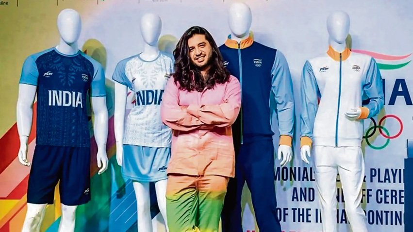
8. India’s “Saffron Shoulders” T20 Kit
India’s move to include more saffron (orange) on the shoulders of their T20 kit was a bold departure from the “Men in Blue” tradition. While it was polarizing at first, it grew on fans because it felt fresh and differentiated the T20 team from the ODI team.
Refreshing by “breaking the rules” of your own brand is risky, but it works when you maintain one core element—in this case, the classic BCCI crest.
9. Scotland’s “Pink Era” (2024)
Wait, Scotland in pink? Yes! Moving away from their traditional navy and purple for a World Cup kit was a genius move. It made them the most talked-about “associate” nation in the tournament.
It was a total brand refresh that screamed, “We are here to be noticed.” For small clubs, this is the best advice: don’t be afraid to be different. If every other team in your league is wearing blue or white, go for something that makes you stand out the moment you step off the bus.
How to Refresh Your Own Team’s Look
Watching these big companies nail their designs usually makes us want to go out and fix our own club’s kit. But where do you start? You don’t need a Nike-sized budget.
- Find Your Core: Pick one color or symbol that defines you.
- Modernize the Icon: Use a free AI logo maker to see how your current crest looks with different fonts or simplified lines. These tools are incredible for visualizing how a logo will look on a shirt before you actually order the fabric.
- Tell a Story: Can you add a small detail—like a local landmark or a significant date—into the pattern of the shirt?
The Final Over
A shirt refresh is more than just a change of clothes; it’s a statement of intent. Whether it’s Australia leaning into their history or Scotland embracing a bold new color, these designs change how fans feel about the team.
Next time you’re thinking about your own team’s gear, take a page out of these playbooks. Keep it simple, keep it meaningful, and don’t be afraid to use modern tech to help you find that perfect look. After all, if you look like a pro team, you’re already halfway to playing like one!
What’s your favorite cricket kit of all time? Let us know in the comments—we’re always looking for more design inspiration!